Google Nest Thermostat
Project description
Developed cohesive user experiences across embedded hardware and mobile platforms, focusing on seamless functionality, visual consistency, and tailored designs for diverse personas, ensuring accessibility, usability, and user satisfaction.
Background
Following Google's decision to spin off the Nest thermostat, three managers propose different market strategies. The challenge was to design a consistent user experience across both embedded hardware and mobile platforms, targeting diverse audiences — Conscious minimalist, Uncompromising geek, and Unwilling employee.
Challenge
The design must meet these needs while maintaining consistent navigation, scheduling, and interactive controls, despite hardware constraints.
Conscious minimalist

Uncompromising geek


Unwilling employee


Process
Designing Seamless User Experiences for Hardware and Mobile Platforms
In a team of four, we collaborated to design consistent and engaging user experiences across embedded hardware and mobile platforms. Targeting three unique user personas—Conscious Minimalists, Uncompromising Geeks, and Unwilling Employees—we aimed to balance functionality, aesthetics, and usability.
Problem Definition
We began by identifying the challenge: creating a unified experience that bridges the gap between hardware and mobile platforms for a diverse audience. This step included:
Conducting user research to understand the needs and pain points of each persona.
Mapping user journeys to identify interaction touchpoints.
Ideation
We brainstormed as a team, using insights from research to explore innovative solutions. Activities included:
Sketching and whiteboarding ideas to visualize potential interactions.
Prioritizing features that aligned with the needs of each persona.
Wireframing and Low-Fidelity Prototyping
To establish the layout and navigation flow, we created low-fidelity wireframes:
Focused on ensuring intuitive navigation for mobile and hardware platforms.
Conducted preliminary usability testing to validate the structure and flow.
High-Fidelity Design and Prototyping
Once the wireframes were validated, we developed high-fidelity prototypes:
Designed playful yet functional interfaces with cohesive visuals across platforms.
Tailored features to personas, such as minimalist controls for Conscious Minimalists and advanced settings for Uncompromising Geeks.
Iterative Feedback and Refinement
We shared prototypes with peers and target users, incorporating feedback to refine designs:
Improved accessibility features, including contrast adjustments and simplified interactions.
Enhanced the user flow to reduce friction during critical tasks.
Final Testing and Handoff
Before finalizing, we conducted extensive usability testing to ensure seamless experiences:
Tested both hardware and mobile interfaces with users to ensure consistency.
Created a developer handoff document with detailed specifications for implementation.
User-Centric Design Directions
In our project, we designed three distinct user experiences for embedded hardware and mobile platforms, tailored to unique personas—Conscious Minimalists, Uncompromising Geeks, and Unwilling Employees. Each design direction included thoughtfully crafted interfaces for both the Nest hardware and the mobile app, ensuring consistency and usability across platforms. For each persona, we designed three key screens: the Home Screen, Scheduling Screen, and Menu Screen. This holistic approach ensured a seamless and engaging user experience for each audience.
Sparrow’s Nest: Conscious Minimalist
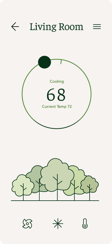
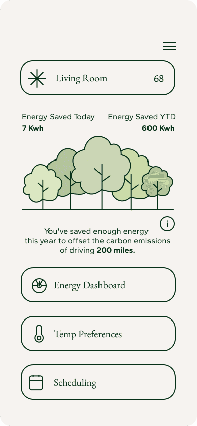
Designed for users who prioritize sustainability and efficiency, Sparrow’s Nest focuses on visualizing energy savings in a meaningful way.
Key Attributes
Adaptable, resourceful, and thrives in simplicity.
Core Concept
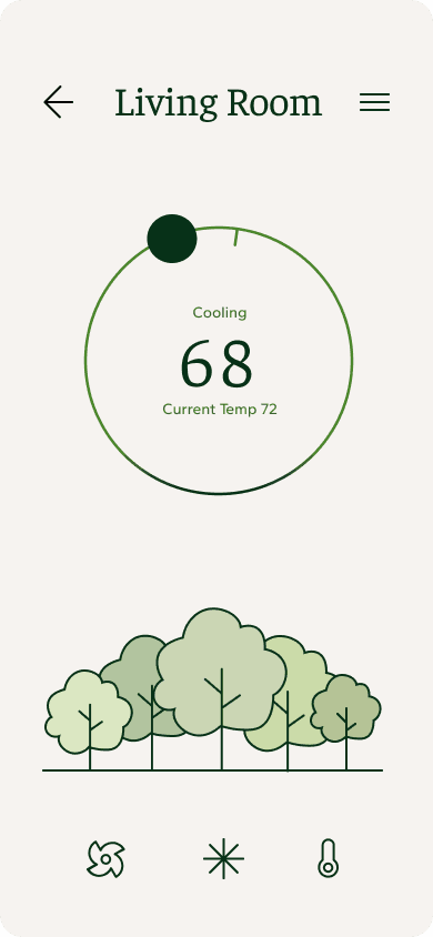
An energy savings scale represented by trees, promoting sustainable habits.
Unique Design Element
Home Screen: Displays energy-saving progress using tree visuals—five lush trees for optimal energy conservation and deforestation imagery for low efficiency.
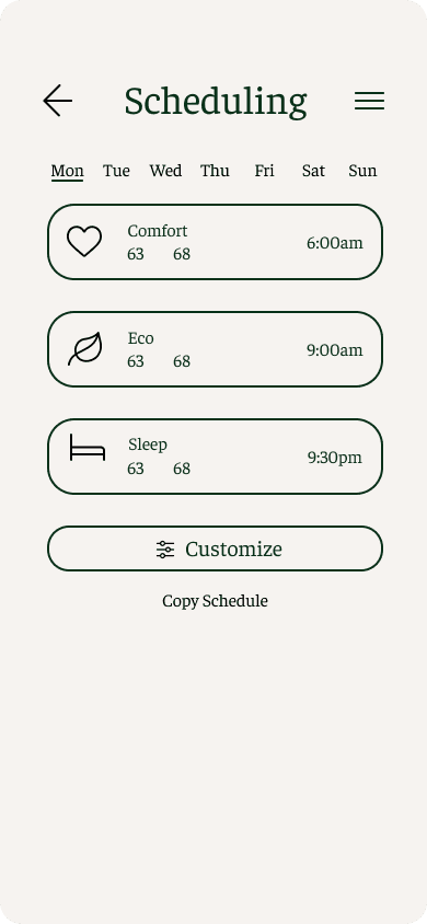
Scheduling Screen: Minimalist layout prioritizing ease of use, allowing quick adjustments with minimal interaction.
Menu Screen: Clean, focused options for streamlined navigation without unnecessary clutter.
Benefit
Encourages environmentally conscious behavior through a simple, relatable visual metaphor, aligning perfectly with minimalist values.
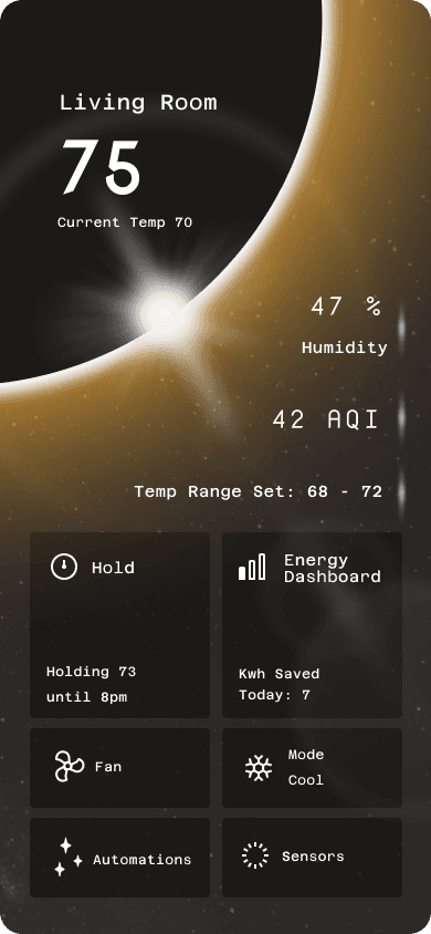
Falcon’s Nest: Uncompromising Geek
Falcon’s Nest is tailored for tech enthusiasts who demand high performance and customization in their tools.
Key Attributes
Speed, precision, and a passion for advanced technology.
Core Concept
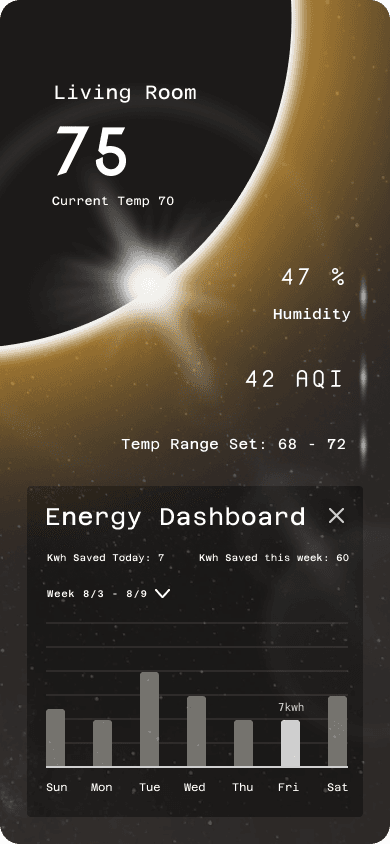
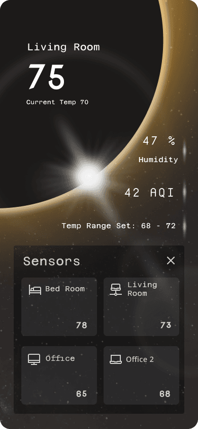
Futuristic and precise, inspired by advanced space technology.
Unique Design Element
Home Screen: Incorporates eclipse visuals and dynamic data displays for real-time information.
Scheduling Screen: Offers advanced scheduling tools with granular control, appealing to users who value precision.
Menu Screen: Fully customizable interface for easy access to frequently used features.
Benefit
Meets the needs of tech-savvy users by offering advanced functionality and customizable options without compromising on performance or innovation.
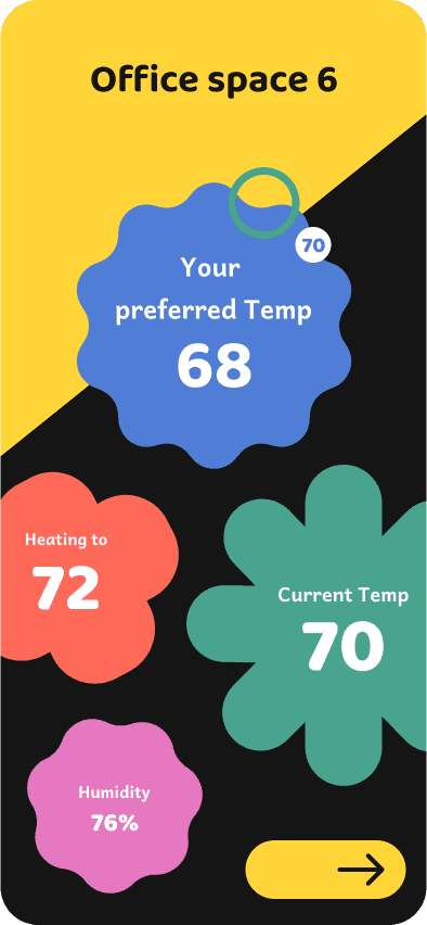
Robin’s Nest: Unwilling Employee
Robin’s Nest was designed to make interactions simple and enjoyable for users who might lack motivation to engage with the device.
Key Attributes
Cheerful, lively, and focused on ease of use.
Core Concept
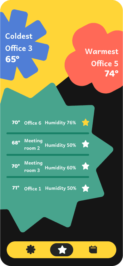
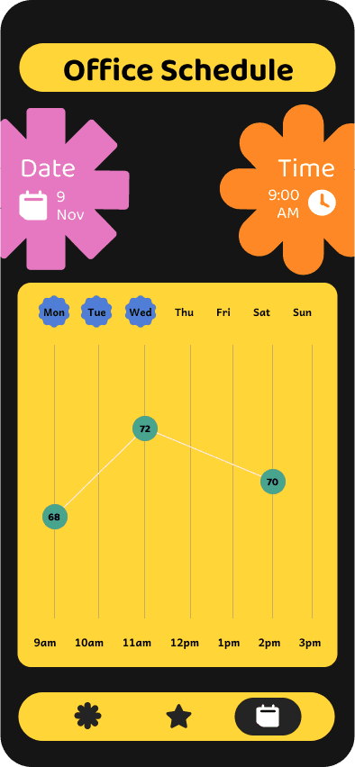
Bold, playful shapes and vibrant colors that create a sense of joy and simplicity.
Unique Design Element
Home Screen: Features bold, cheerful visuals with clear, large controls for essential functions.
Scheduling Screen: Streamlined process with engaging graphics to make scheduling less tedious.
Menu Screen: Intuitive layout with minimal options to reduce decision fatigue.
Benefit
Lowers barriers to engagement by making the interface approachable, enjoyable, and easy to navigate.
What We Learned as a Team
Our collaborative design process taught us valuable lessons about teamwork, workflow, and adaptability. Here are the key takeaways:
The Importance of Team Meetings
Coming together as a team regularly was essential for ensuring alignment, increasing efficiency, and fostering collaboration. Through consistent team meetings, we were able to:
Share progress and receive constructive feedback.
Refine our ideas collectively, ensuring they were well-rounded and thoughtfully considered.
Resolve roadblocks more effectively by pooling our collective insights and expertise.
These meetings not only streamlined our workflow but also strengthened our communication, making the project more cohesive and efficient.
Challenges of Splitting Work
Dividing responsibilities among four team members proved to be a complex task, as we had to ensure every piece aligned seamlessly with the overall vision. Some challenges we encountered included:
Keeping track of individual progress and responsibilities.
Balancing workloads to avoid bottlenecks or overlaps.
Despite these hurdles, we adapted by maintaining clear documentation, regularly updating each other, and being flexible in reassigning tasks as needed. This approach ultimately helped us deliver a unified and polished design.
Working in Black and White First
We learned the importance of starting with grayscale designs before introducing colors. By focusing on structure, layout, and hierarchy without the distraction of colors, we could:
Prioritize functionality and usability in the early stages.
Create designs that were clear and consistent, regardless of aesthetic elements.
Avoid premature decisions about color schemes, which might otherwise have required significant revisions later.
Embracing Change: Don’t Fall in Love with a Design
At times, we found ourselves hesitant to make changes to designs we were attached to. However, we realized that iteration is a fundamental part of the design process. By embracing change, we were able to:
Improve designs based on feedback and new insights.
Stay adaptable to better meet user needs and project goals.
Avoid stagnation, ensuring that every aspect of the project was refined to its fullest potential.
This mindset shift allowed us to deliver solutions that were not only well-designed but also deeply user-focused.
These lessons highlighted the importance of flexibility, communication, and a structured workflow in delivering a successful project. They will undoubtedly guide us in future collaborations and design challenges.
Additional Resources
Link to Figma file
